Wordmark logo examples show how powerful text alone can build instant recognition. In fact, research of Exploding Topics reveals that 31% of companies employ wordmark logos, making them a leading choice for clear brand visibility.
By turning simple typography into a distinctive identity, these logos help brands stay memorable and connect with audiences on every platform. Here, we’ll explore standout logo examples and uncover how they can inspire your brand identity.
Key Takeaways:
- Instead of symbols, wordmark logos rely on typography, making them a powerful choice for clear and recognizable branding.
- They work best for brands with short, unique names and require careful font and color selection for maximum impact.
- Versatility is a major advantage—wordmark logos adapt easily across digital and print platforms without losing clarity.
- Many successful brands, like Google or Coca-Cola, show that a strong wordmark logo can build trust and long-term identity.
What Is a Wordmark Logo?
A wordmark is a type of logo design that includes only the company name, without symbols, mascots, or badges. This minimalist style highlights clarity and reinforces brand recognition, ensuring that the name itself becomes a strong visual identity.
In essence, the wordmark logo meaning relies on typography as its main design element. Unlike emblem or symbol-based designs, wordmark logo examples use distinctive fonts and styling to convey the brand’s personality, making the name memorable and visually powerful.
Why do Brands Choose Wordmark Logos?
If you run a business, choosing the right type of logo is crucial for building a strong identity. Many brands prefer wordmark logos because they deliver a clean, recognizable look that communicates the brand message instantly and effectively.
Here are key reasons why wordmark logos can be an ideal choice for your brand:
- A short and distinctive name: a brief, unique name (ideally one word) makes the logo more impactful and easier to remember.
- Multi-platform flexibility: wordmark logo integrates seamlessly across digital, print, and social media without clashing with competing icons.
- Creative simplicity: typography and color variations allow you to express personality while keeping the design timeless and versatile.
5 Wordmark Logo Examples and Their Effectiveness
To spark your creativity, we’ll look at the best wordmark logo examples from well-known brands. By seeing how top brands transform typography into identity, you’ll gain ideas to adapt for your logo design.
1. Google

Google wordmark logo | Pexels – Sarah Blocksidge
Google’s wordmark logo is a perfect example of simplicity with impact. Its sans-serif font paired with bold colors makes it friendly, modern, and easy to read on any screen. This simplicity echoes Google’s goal of making information easy to find and widely available.
Over the years, Google has refined its wordmark to improve digital readability without losing brand recognition. Every redesign focused on flexibility for digital platforms. This adaptability demonstrates why brands choose wordmark logos: they remain versatile and highly recognizable in any context.
2. Coca-Cola
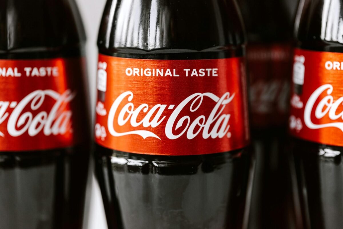
Bottle of Coca-Cola wordmark logo | Source: Pexels – Kaboompics.com
The Coca-Cola wordmark logo stands as the most enduring example of brand identity built on typography. Its flowing Spencerian script conveys a sense of tradition and timelessness, resonating with generations of consumers.
Coca-Cola’s commitment to its wordmark highlights how consistency builds brand trust. Despite evolving marketing strategies, the logo has remained largely unchanged for decades. It proves how a simple wordmark can carry cultural value over time.
Also Read : How to Create a Memorable Logo: 8 Practical Steps With Tips
3. FedEx
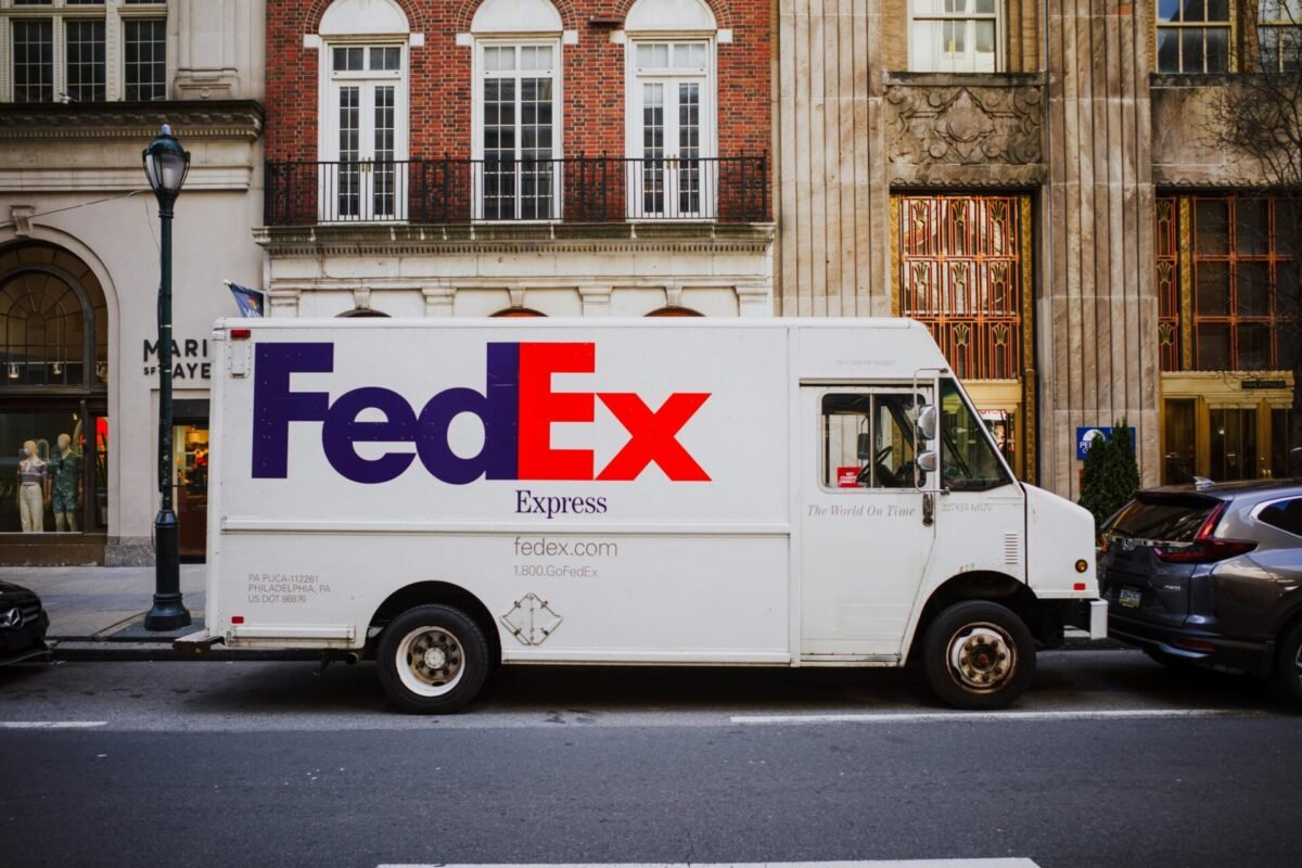
FedEx’s logistic truck illustration | Source: Pexels – Kelly
FedEx is a masterclass in how a clever design element can elevate a wordmark logo. At first glance, it appears as a simple bold typeface, but the hidden arrow between the “E” and “x” subtly conveys speed and precision. This design choice adds depth without sacrificing simplicity.
FedEx enhances its adaptability by using distinct colors for each service, such as orange for Express and green for Ground. This flexibility ensures brand recognition while signaling service differentiation, all within a consistent framework.
Also Read : 10 Best AI Logo Design Tools 2025: Build Professional Logos Fast
4. Disney
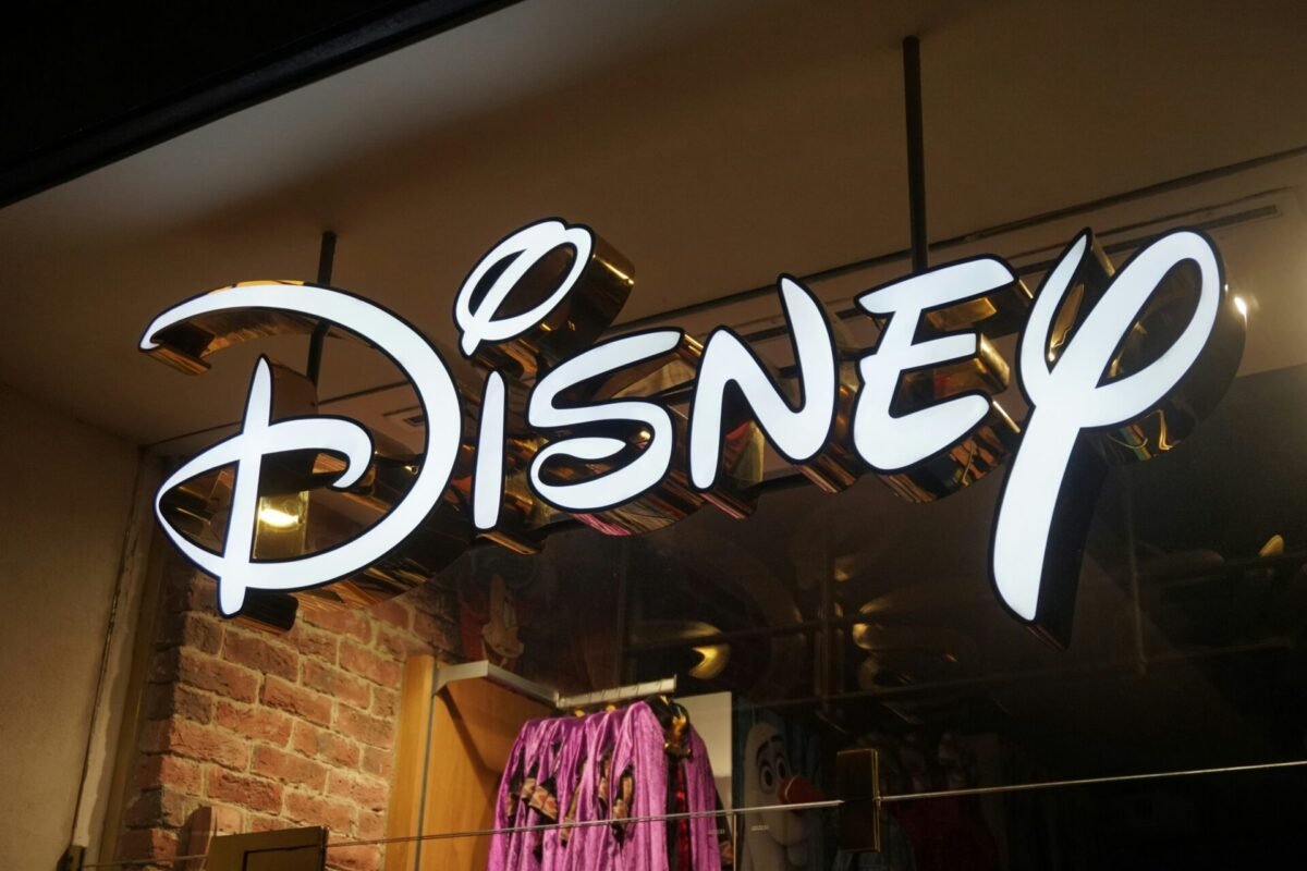
Disney wordmark logo | Source: Unsplash – Keoma Oran
Among Wordmark logo examples, Disney’s logo radiates magic and creativity. The distinctive lettering, especially the whimsical “i” and looping “y,” reinforces its playful character. Also, its handwritten-style lettering instantly transports viewers to a world of creativity and storytelling.
Even after modernization, those signature letters remain untouched. This consistency keeps the logo authentic while appealing to new audiences. Disney proves a wordmark can balance nostalgia with a fresh look.
Also Read : 10 Essential Web Design Tips for a Small Business
5. Visa
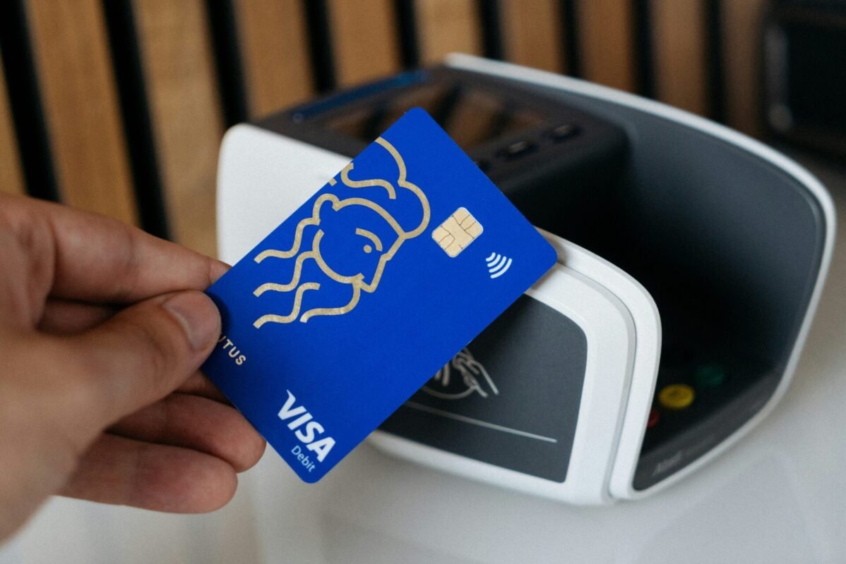
ATM card with Visa wordmark logo | Source: Unsplash – CardMapr.nl
Visa’s wordmark logo represents clarity and reliability—key traits for a financial services provider. A simple bold font ensures readability across physical cards to digital payment platforms. The subtle color scheme, typically blue and gold, communicates credibility and excellence.
The strength of Visa’s wordmark lies in its scalability and adaptability. It looks just as clear on a small chip card as it does on a massive billboard. This consistency reinforces Visa’s reputation for stability and trust, showing how a simple wordmark can carry global impact.
Also Read : What Is a Monogram Logo? Definition, Function, and Examples
Turn Inspiration into Your Own Wordmark Logo
The rising popularity of wordmark logos shows how simplicity and strong typography can create timeless brand identities. From Google’s colorful minimalism to Coca-Cola’s classic script, these examples prove that a well-crafted wordmark is more than just text.If the big names above can do it, so can you. Explore the Bold Brush Fonts Collection from Letterara Studio. You can create stunning wordmark logo examples that combine creativity and style. With bold strokes and expressive details, these fonts will guarantee your brand speaks with confidence.