
Common mistakes in website design can be bothersome in creating a great website, which requires a deep understanding of user experience and design principles. It’s easy to fall into traps that can negatively impact a site’s performance and usability, even for the most passionate creators.
Fortunately, these pitfalls are easy to avoid once you know what they are. We’ve compiled a list of common web design mistakes to avoid that you need to know. By proactively avoiding these pitfalls, you can significantly improve the quality of your work and boost user satisfaction.
Key Takeaways
- Avoiding common web design mistakes is critical for improving a site’s usability and overall performance.
- Identifying common web design issues enables you to create effective designs and strengthen the user experience.
- Effective design focuses on clarity, a user-centered approach, and mobile responsiveness.
Common Mistakes in Website Design Examples
To build a more effective and user-friendly website, start by recognizing these pitfalls and understanding why they matter.
1. Cluttered and Confusing Layouts
A poorly designed website will drive users away. Overloading a page with too much information, disorganized content, or an abundance of pop-ups creates a poor user experience. According to a 2024 study by the Nielsen Norman Group, users want to find what they’re looking for quickly, and a cluttered user interface slows them down.
How to Fix It: Embrace whitespace. Use a clear visual hierarchy to guide the user’s eye and organize content with headings and subheadings.
Also Read : How to Build an Interactive Website in 10 Steps
2. Poorly Chosen Typography

Typography in website design / Source: Pexels – Karolina Grabowska
Often overlooked, typography is among common mistakes in website design, as this is a critical component of every design. Using fonts that are too small, difficult to read, or excessively decorative can make a website feel unprofessional and frustrate visitors. Poor readability of fonts is also a major reason for high bounce rates, as it makes content difficult to digest.
How to Fix It: Choose fonts that are legible and appropriate for the brand. Stick to a maximum of two or three font families to maintain visual consistency.
3. Lack of Mobile Responsiveness
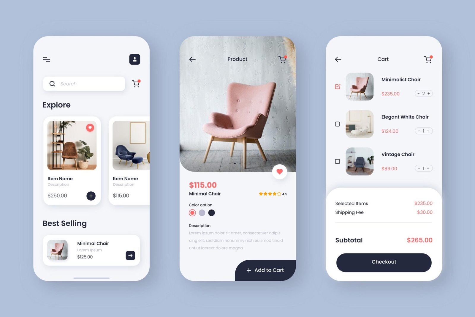
Mobile responsiveness of website design example / Source: Freepik – Freepik
With a majority of internet traffic coming from mobile devices, a non-responsive website is a huge oversight. It forces users to pinch and zoom, leading to a frustrating experience that often drives them away. What’s more, a non-responsive site negatively impacts your search engine ranking, as Google’s official SEO guidelines emphasize the importance of having a mobile-friendly site.
How to Fix It: Start by focusing on mobile design first. Check how your website performs on different devices, and utilize a responsive framework such as Bootstrap or CSS Grid to guarantee it appears well on all screens.
4. Inconsistent Branding and Visuals
Your website should reflect your brand identity. Mismatched colors, different button styles, or varying image filters across pages are common mistakes in website design examples that can confuse users and make the brand seem untrustworthy.
How to Fix It: Create a style guide that defines your color palette, typography, and visual elements. Refer to this guide for every page you create.
Also Read : Web Design Footer Best Practices with 10 examples
5. Slow Loading Times

slow loading time illustration / Source: Freepik – rawpixel.com
Users expect websites to load instantly. Slow-loading websites certainly can reduce user satisfaction and lead to frustration, causing visitors to abandon the page before they even see the content. This can also negatively affect your search engine ranking and reduce conversion rates, as a user is far less likely to complete a purchase or sign up if they have to wait.
How to Fix It: Reduce image file sizes without sacrificing visual quality. Use browser caching, minimize CSS and JavaScript files, and consider a Content Delivery Network (CDN) to speed up delivery.
6. Invisible or Non-Functional Calls to Action (CTAs)
A great website guides users toward a specific goal, whether it’s making a purchase or signing up for a newsletter. CTAs that are poorly designed, hidden, or don’t work are a classic design mistake.
How to Fix It: Use clear, actionable language for your CTAs (e.g., “Shop Now,” “Learn More”). Make them visually distinct with contrasting colors and place them in prominent positions on the page.
Also Read : 11 Interactive Website Examples That Inspire Creativity
7. Overuse of Animations and Special Effects
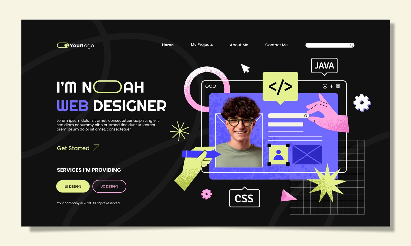
Too many animation examples / Source: Freepik – Freepik
Overly complex animations are one of the common mistakes in website design. They can feel gimmicky and take the focus away from your content and, in some cases, can even slow down your site’s performance. Effective use of animation or motion design should focus on clarity and user interaction, not on overwhelming the visitor.
How to Fix It: Use animations sparingly and with purpose. Ensure they add value, like guiding a user’s attention or providing feedback, rather than just being there for decoration.
8. Lack of Accessibility
Everyone should be able to access websites. Failing to consider accessibility can exclude a large portion of your audience and may even lead to legal issues.
How to Fix It: Use high-contrast colors, provide alt text for all images, and ensure your site can be navigated using a keyboard. Failing to provide these basic features is directly linked to legal accessibility issues.
9. Not Testing with Real Users

test with user illustration / Source: Freepik – Freepik
You might think your design is perfect, but real users often expose flaws you never considered. One of the top 10 mistakes in web design is skipping the user testing phase.
How to Fix It: Conduct usability tests with a small group of people who match your target audience. Observe how they interact with your site to identify pain points and areas for improvement.
10. Ignoring the Power of a Good Brand Voice
Beyond the visual design, a website’s tone and language play a huge role in brand perception. Lackluster or unclear writing can cause your brand to appear detached.
How to Fix It: Define a brand voice that resonates with your target audience. Use this voice consistently in all written content, from headlines to button text.
Also Read : How to Build an Interactive Website in 10 Steps
Your Next Step: Design with Purpose
In summary, avoiding these common mistakes in website design will set you on the path to creating a high-quality, professional, and user-friendly site. By focusing on clarity, consistency, and a great user experience, you can build websites that not only look good but also perform exceptionally.Elevate your projects and captivate your audience with Letterara Studio’s curated font selections for website design professionals and enthusiasts.