
Despite the numerous ways for people to introduce themselves online today, business cards remain powerful networking tools that create lasting first impressions in professional environments. Because of that, some need to learn how to make business cards with professional designs.
Key Takeaways:
- Choosing the right size, layout, typography, and color scheme ensures business cards look professional, readable, and aligned with brand identity
- Focus on essential contact information, maintain visual balance, and avoid clutter to leave a strong and lasting impression
- Using high-quality paper, finishes, and printing services gives business cards a polished look that elevates credibility in professional settings
Steps on How to Make Business Cards as Professionals
Without further ado, here’s how to design a business card that balances visual appeal with clear communication objectives!
Step 1: Choose the Right Size and Shape
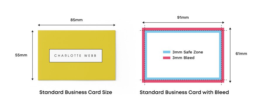
Standard size of premium business cards (Source: Instantprint)
To start learning how to make business cards, start by knowing that standard business card dimensions measure 3.5 x 2 inches, providing familiar formats that fit wallets and cardholders. Meanwhile, alternative sizes include square cards (2 x 2 inches) for unique branding and slim cards for minimalist approaches.
Although you can choose either orientation, remember that vertical orientations create distinctive appearances and horizontal layouts offer traditional professional aesthetics. When selecting card dimensions, consider your industry standards and target audience preferences.
Step 2: Select Professional Paper Stock and Finish

Example of matte business cards (Source: Primoprint)
In this step, you can choose premium cardstock between 14-16pt thickness, which provides professional durability and cost-effectiveness for most applications. Depending on your preference, you can choose heavier stocks to create luxury impressions or thinner materials to reduce printing costs significantly.
Furthermore, you can choose matte finishes that offer sophisticated appearances with excellent print quality. Alternatively, you can choose glossy coatings to enhance the business card’s color vibrancy.
Step 3: Design an Effective Layout Structure

Example of effective business card layout structure (Source: Freepik)
When designing your business card’s structure, use grid systems that can organize information hierarchically and create visual balance throughout card layouts for professional appearances.
Make your business card readable by balancing text and white space to prevent overcrowding across different lighting conditions. For a professional look, arrange information to follow horizontal or vertical reading patterns for easier understanding.
Also Read : How to Create a Memorable Logo: 8 Practical Steps With Tips
Step 4: Incorporate Your Logo Strategically
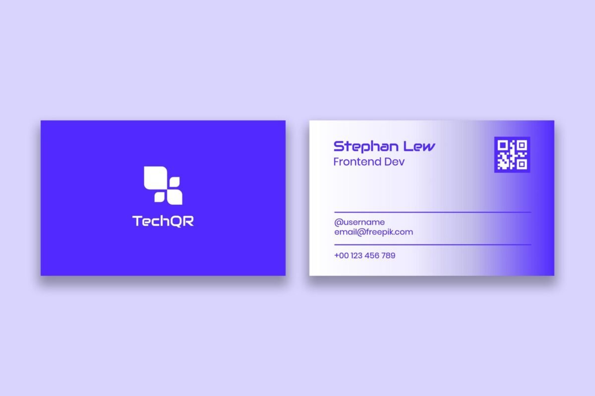
The strategic emplacement of the company logo in a business card (Source: Freepik)
Logo placement significantly impacts brand recognition and overall design effectiveness throughout business card presentations. As a result, position logos prominently without overwhelming essential contact information or creating visual conflicts.
Maintain consistent logo sizing and placement across all marketing materials to reinforce brand recognition systematically. Furthermore, ensure logo resolution remains sharp at business card sizes to adhere to your brand guidelines.
Step 5: Choose Appropriate Typography
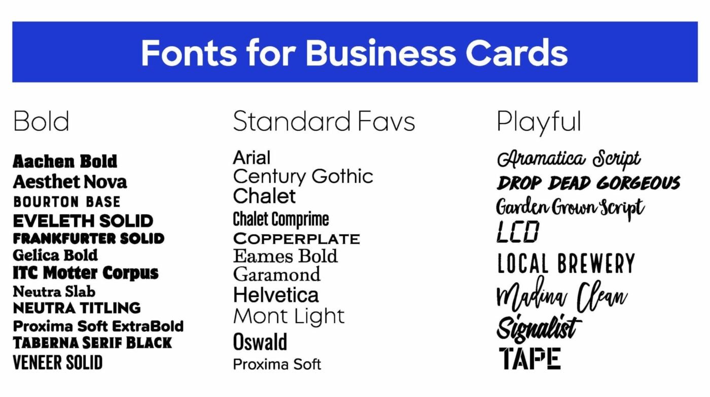
Suitable fonts for business cards (Source: Custom Ink)
Next, select fonts that reflect brand personality and maintain excellent readability across various lighting conditions and age groups. In this regard, limit font families to a maximum to prevent visual confusion and maintain design cohesion.
A clear font hierarchy improves readability. Strategic use of size, weight, and placement helps highlight the most important details while keeping supporting information subtle. For instance, you can use larger, bolder fonts for essential information or smaller, lighter fonts for extra details.
Step 6: Develop a Cohesive Color Scheme
Example of cohesive color palettes for a business card (Source: Freepik)
Color psychology plays a powerful role in shaping first impressions and brand perception during professional networking and business interactions. Therefore, choose colors that align with industry standards while reflecting your brand’s personality.
Keep color palettes to a maximum of four or five hues to enhance the card’s visual impact while maintaining printing cost-effectiveness and visual elegance. You should also consider color contrast requirements for text readability across different backgrounds and lighting conditions.
Also Read : 16 Profitable Sign Business Ideas That Stand Out in Any Market
Step 7: Organize Contact Information Effectively
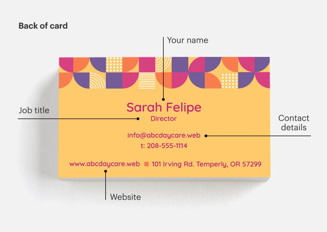
Effective business card information placement (Source: Vistaprint)
Less is better, so only include essential information in your card, like name, job title, company, phone number, email address, and website URL. Avoid cluttering cards with excessive social media handles or unnecessary details that distract from primary objectives.
Prioritize information based on primary communication preferences and target audience expectations within your specific industry. Still, always include your phone number and email so potential colleagues can contact you for opportunities.
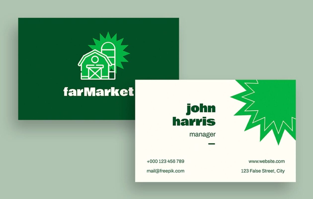
Step 8: Add Visual Elements and Graphics
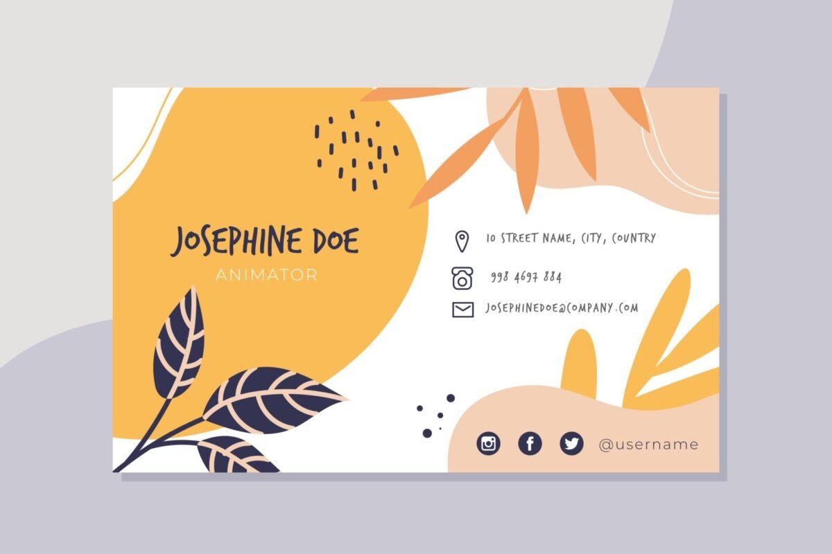
Extra visual elements in a business card (Source: Freepik)
In this step on how to make business cards, you can use icons, patterns, or illustrations with subtle yet noticeable designs that can support brand identity and look professional to your potential counterparts at the same time.
An important part of this step is fully understanding that background patterns or textures should remain subtle enough to preserve text readability and add visual interest. You should also avoid busy backgrounds that compete with text or logo elements for attention.
Also Read : 10 Essential Web Design Tips for a Small Business
Step 9: Review and Proofread Thoroughly

Reviewing the print of a mockup business card (Source: Tap Tag)
Before printing your business card, be sure to verify the accuracy of all contact information, including phone numbers, email addresses, and website URLs. If anything like spelling errors still exist, such errors can create unprofessional impressions that damage your credibility significantly.
Moreover, you should also check alignment, spacing, and overall design consistency across all elements for polished final results. You should also review the cards at actual size to identify potential readability issues or design problems.
Step 10: Select Professional Printing Options
Result of a professionally-printed business card (Source: Array Printing)
In this last step of how to make business cards, you must choose professional printing services that deliver superior quality compared to home printing options. Even so, you still have to compare things like pricing, turnaround times, and quality samples from multiple vendors before selecting providers.
Digital printing often offers cost-effectiveness for small quantities, while offset printing provides better quality for large runs. Additionally, consider quantity requirements and budget constraints when selecting printing methods.
Also read : How to Build an Interactive Website in 10 Steps
Make Your Business Cards Look More Professional with the Best Fonts!
After reading the steps above, we can now know that everything from layout and color choices to paper quality and finishes matters in learning how to make business cards. These elements work together to present you as a true professional and help your card attract the right attention.Typography is one element of any business card you should never overlook. Letterara Studio offers a wide collection of custom fonts that can help you design a business card example! With its versatile font collections, the studio is a trusted resource for business cards as well as other professional design projects.