A logo is the face of your business and a key element of visual branding. Its style is essential in shaping audience perception and driving marketing impact. When it comes to choosing the right logo, two powerful options often come into play: logomark vs logotype. Each offers unique benefits depending on your brand’s goals and strategy.
In this article, we’ll learn how both types can help you create a strong, recognizable brand identity.
Key Takeaways:
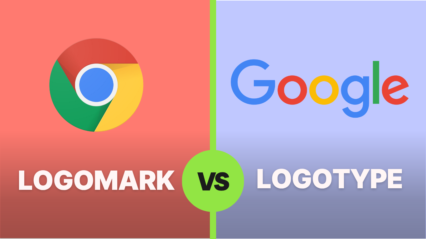
- A logomark is a symbol or icon-based logo that visually represents a brand, like Apple’s bitten apple.
- A logotype uses custom typography to display a brand’s name or initials, such as Google’s logo.
- Logomarks are ideal for responsive design due to their scalability, while logotypes work well for brands seeking clear name recognition.
Logo vs Logotype vs Logomark: The Definitions
A logo, logotype, and logomark are related terms, but they have different meanings. Let’s clarify what sets them apart.
What is a Logo?
A logo is a broader term that refers to any graphic mark representing a brand. Therefore, it can be a logotype, a logomark, or a combination of both.
What is a Logotype?
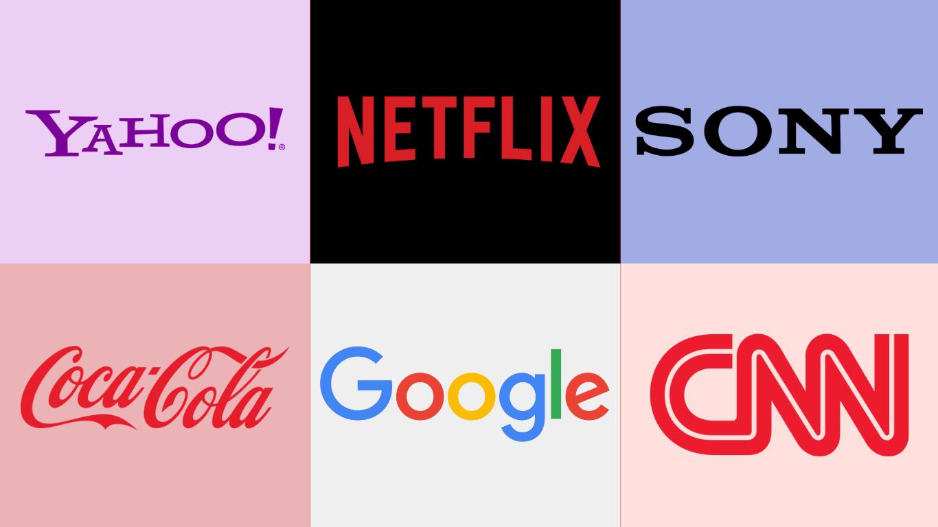
When comparing logomark vs logotype, the logotype tends to be more direct. This logo uses custom typography to display a brand’s name. It focuses on verbal identity and helps with direct recognition. Notable examples of this logo are Google, Netflix, and Sony.
Advantages:
- Clear and easy to remember.
- Builds name recognition.
- Prevents brand confusion.
- Supports puns, slogans, or taglines.
Disadvantages:
- Can be difficult to scale for responsive design.
- Less visually creative.
- Risk of outdated fonts.
- Ineffective for hard-to-pronounce names.
Tips for Creating a Logotype:
- Choose a legible, distinctive font.
- Adjust spacing and consider stylistic details, such as ligatures and swashes.
- Test at various sizes for readability.
- Use safe color schemes, like monochrome or analogous.
Also Read: 30+ Best Logo Prompts AI for Small Businesses and Creatives
What is Logomark?
Unlike a logotype, a logomark relies solely on a symbol or icon to showcase the brand vision. Although it seems more abstract and symbolic, it can be more memorable than a logotype. For instance, when seeing an icon of a bitten apple, it might remind you of the Apple brand and its tech products.
Advantages:
- Visually unique and creative.
- Ideal for responsive design.
- Crosses language barriers.
- Great for global recognition.
Disadvantages:
- Not instantly recognizable for new brands.
- May be misinterpreted without context.
- Risk of looking similar to others if not unique.
Tips for Creating a Logomark:
- Research existing logomarks for inspiration and differentiation.
- Use bold shapes and clean lines for contrast.
- Don’t be afraid of literal symbols (e.g., a thunder icon for the “Thunder” name).
- Keep it minimal and leave room for whitespace.
Also Read: How to Patent a Logo and Secure Your Brand Identity
Logomark vs Logotype: Key Difference
To better understand the difference between logotype and logomark, refer to the comparison table below.
| Feature | Logomark | Logotype |
| Appearance | Icon and symbol. | Brand name or custom typography. |
| Recognition | Requires audience familiarity. | Offers immediate name recognition. |
| Best for | Brand recall without words. | Brand name recognition. |
| Scalability | Flexible, great in a small size. | Compact, it can be complex at a small size. |
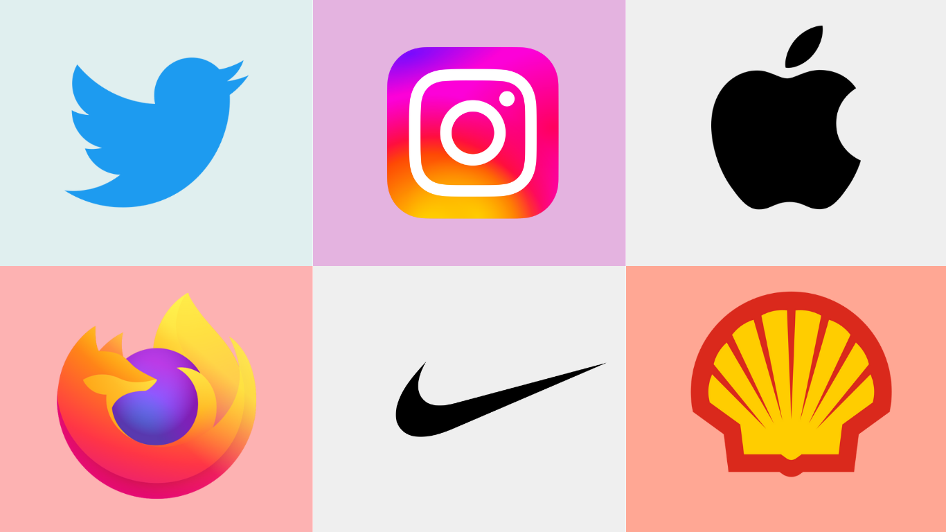
| Examples | Instagram, Chrome, and Mozilla Firefox. | Coca-Cola, Yahoo, and CNN. |
Logomark vs Logotype: Which One Should You Choose?
Choosing between a logomark and a logotype can be frustrating. Use the following points to guide your decision.
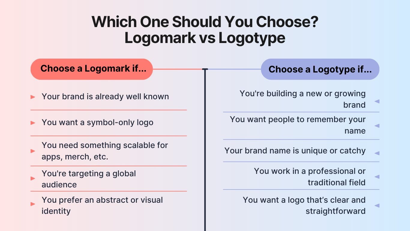
1. Message
If you like to be direct about your brand, a logotype would be ideal. But if you want to let your audience interpret the meaning of your brand, choose a logomark.
2. Audience
Logomark is great for a well-established audience. It also fits a global audience since it doesn’t limit language barriers. Meanwhile, a logotype is better for a lesser-known brand, giving easier brand name recognition.
3. Flexibility
A logomark is more flexible for various media, like websites, merchandise, and printing media. On the contrary, the logotype needs to be adjusted to match several media, for example, using the initial rather than the full name.
4. Artistic Choice
For a simple reason, use a logomark if you think a symbol reflects your artistic style. Otherwise, choose a logotype if you are fond of creating beautiful text.
Also Read: Freelance vs Contract: Key Difference You Should Know
Why Not Combine Both Logomark and Logotype?
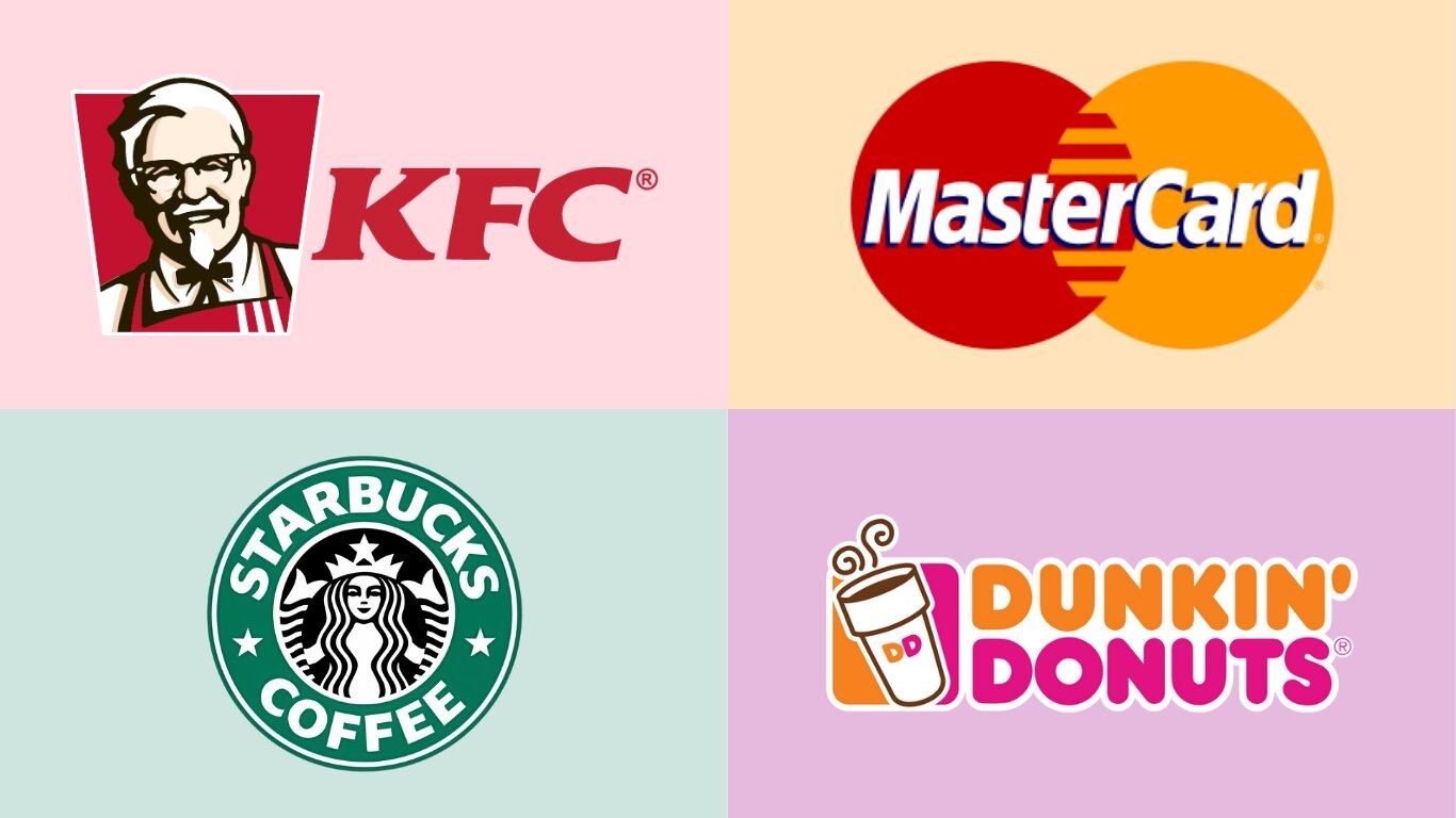
In the ongoing debate of logomark vs logotype, there’s also a third option: use both. A combination mark blends text and symbol, giving your brand the clarity of a name with the visual impact of an icon.
This approach is especially helpful for new or lesser-known brands, as it builds recognition through both elements. However, be mindful. Combination logos can become visually complex and may require careful scaling across different media.
Also Read: 25 Easy Online Jobs for Teens to Make Money from Home
Typography or Icon? Let Your Brand Decide
In the discussion of logomark vs logotype, which one aligns best with your brand? A logomark offers visual impact and adaptability, while a logotype puts your brand name front and center. You can also combine both to create a well-rounded identity that blends recognition with meaning.
If you’re designing a logotype or combination mark, font choice is crucial. For this reason, leveraging fonts for unforgettable logo design can help you communicate your brand’s image and personality clearly.At Letterara Studio, you’ll discover awe-inspiring fonts with flexible licensing, perfect for building a strong and lasting brand identity. Explore our site now to find great offers!